Hello everyone, I would like to welcome you to another Xanadu Gallery mentorship session.
Due to the subject matter of this week’s lesson, I’m creating a written tutorial instead of a video. As I mentioned in the last session, this week we are working on Judith’s show Invitation. My goal is to provide you with some insight into the tools we use for graphic design and our process for putting together an invitation. A written tutorial should be easier to follow than a video if you want to use it to help create your own invitation or other design.
Those of you who aren’t as technically inclined will still gain insight from this tutorial as you learn some of the broad principles we follow to create show invitations. If you hire a graphic designer to help you create a show invite, the principles we’ll talk about today will help you have a more informed discussion as you work with your designer.
To begin, allow me to share a bit of the history of our forays into design so you have an idea of where I’m coming from and some perspective on the realities of putting together print material.
To do this, we are going to have to take a trip way back in time. We are going to go back to a time before Xanadu Gallery even existed. We’ll go back, in fact to 1998 when I first married my wife Carrie.

Ah yes, there we are, young and happy and, I would say, blissfully naive!
In 1998, Carrie was finishing a degree in public relations, and I was working in the front office of a fine art foundry.
We have to go back this far, because it just so happened that Carrie was required to learn the basics of graphic design as part of her degree. Being the eager young husband that I was, I helped her set up a computer and the programs she needed in order to do basic design work.
Keep in mind that this was in the dark ages of the internet and digital design and we were using programs that don’t exist anymore. Fortunately, I had a real interest in digital technology and an aptitude for software, and so I was able help quite a bit as she worked on her design class homework.
After a semester or two, I had a pretty good idea of the mechanics involved in page layout and design. We were getting a 2-for-1 graphics design education! Carrie and I had fun completing brochures for advertising and public relations campaigns, and we also created a newsletter recounting our adventures as newlyweds – keep in mind that this was before blogs existed.
Now, jump ahead a few years as Carrie and I decided to launch Xanadu Gallery. We had poured all of our savings into the business and had borrowed quite a bit besides. The gallery was open and we were beginning to make sales, but in those early days, cash was in extremely short supply. When it came time to put together advertisements for local magazines and show invitations, there simply wasn’t enough in the bank account to hire an expensive advertising firm or graphics design team to create our materials.
We decided that, with the knowledge and tools we already had, we would just have to do the work ourselves.
We were fortunate that the advertising and graphic design world was in the midst of a revolution as everything was shifting to digital and that we already had the tools from Carrie’s classes to be able to do the work ourselves.
We quickly discovered that there was a lot we didn’t know about designing in the real world, but we also discovered that we were smart enough to figure it out.
We learned that magazines provide guidelines called “mechanical specifications”, or “ad specs”, that give you pretty clear guidelines for setting up your ad. Online printing companies that produce postcards, brochures and catalogs provide similar specifications, and many even provide templates for their most popular products in a variety of versions for the most popular software.
There’s still a learning curve to figure out what everything means, but once you get through that learning curve, you’ll find that having the flexibility to design a produce your own materials will be incredibly powerful. Though a lot can be done through email and a blog, there are going to be times and events where you will want to have printed material.
We primarily produce printed material for show invitations – everything else we do at this point is completely digital. If you are participating in an open studio tour or an art festival, it can be valuable to have a takeaway to provide your clients after you’ve recorded their contact information.
I’m going to show you how I work to create an invitation, but keep in mind that there’s more than one way to skin a cat when it comes to any step along the way.
Again, my hope is that if you haven’t done design work before, you could follow the steps I’ll share with you to create your own design.
I’ll also mention that we typically use a bevy of different design software from Adobe – these include Photoshop, InDesign and Illustrator. For today’s demonstration, however, I’m going to use only Photoshop. Many of you are using photoshop to process your photos already. I’ll show you how you can use the software to do simple design work.
There are times when we use Photoshop in exactly this way – we used photoshop to design this postcard for our current show for artist Guilloume. We’ll use InDesign when we are producing catalogs with multiple pages.
Adobe has changed their software model over the last few years to provide their apps on a subscription basis. You no longer have to pay hundreds, or thousands of dollars to buy their software, instead you sign up for a monthly fee. You can get access to all of their software for about $50 per month, or you can have access to just photoshop for $20 per month.
This model ends up being pricier than just buying the software outright if you are going to be using the software long-term, but you do get updated to the latest versions of everything at no additional charge, and for someone who is only an occasional user, signing up only when you need the software might actually be more economical.
We’re going to walk through the design process today and by the time we’re finished, we’ll have a completed the design for Judith’s show invitation. What you won’t see, however, is that I will pass the design by my graphic designer and to Judith before we declare the design complete. And yes, I do have a designer I work with now that we are well-established.
This is another point to keep in mind. As you are in the early phases of your career it probably makes sense to do everything you can yourself to economize. As you become more successful and your time becomes more valuable, you have to be careful to decide what is the best use of your time.
I can’t afford to spend a lot of time doing graphic design these days – which makes it fun to do a project like this – I feel like I’m getting back to my roots!
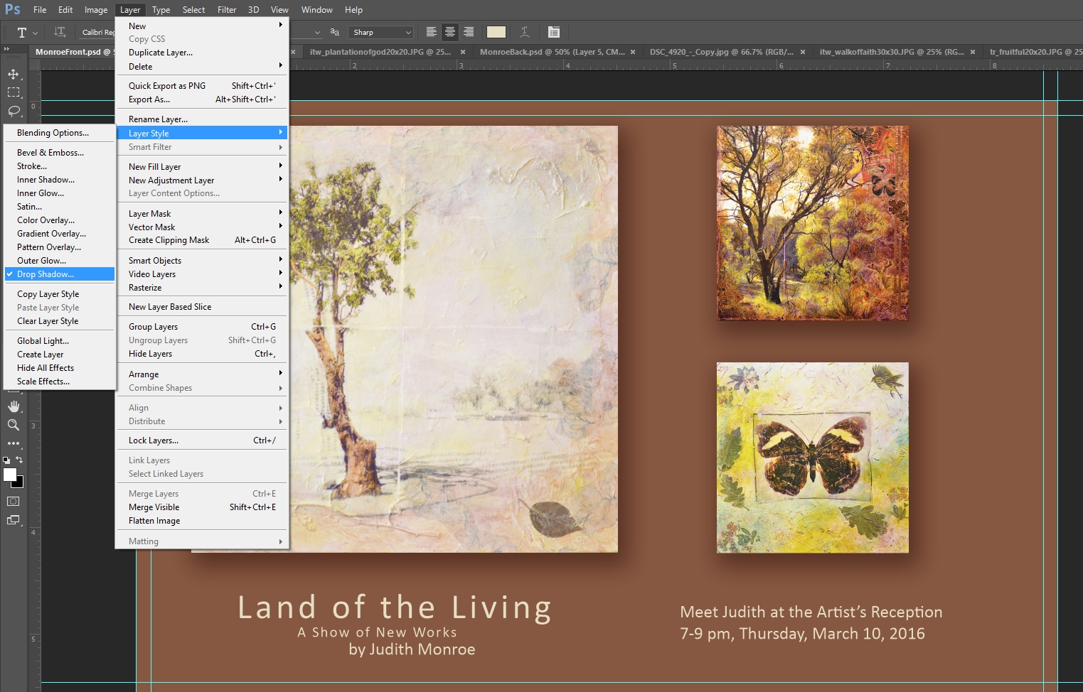
I’ll also mention that when I’m working on the initial design layout, I’m a bit old-school. I like to begin with paper and pen to rough in the design. I find that working through the design on paper is more natural for me. This initial design is to get a sense of where I’m going to place the artwork.
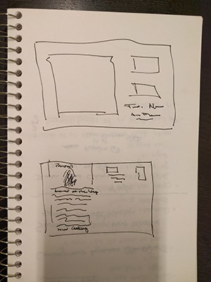
So here you can see what I’m thinking for the design for Judith’s card, and you can also see why I’m a gallery owner, not an artist!
Now that I have a rough idea of what I want to do, I’ll get to work on creating the invitation.
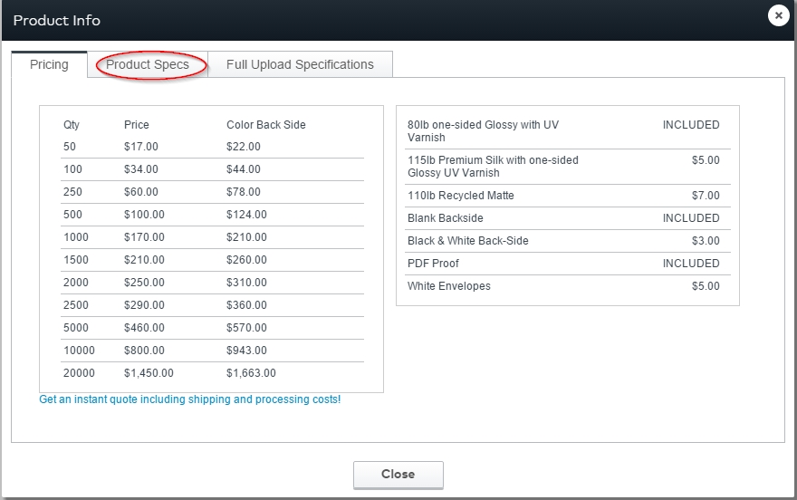
The first thing we need to do is get the specs for our design. We’re going to print our invitation as a postcard, just like the Guilloume invitation.
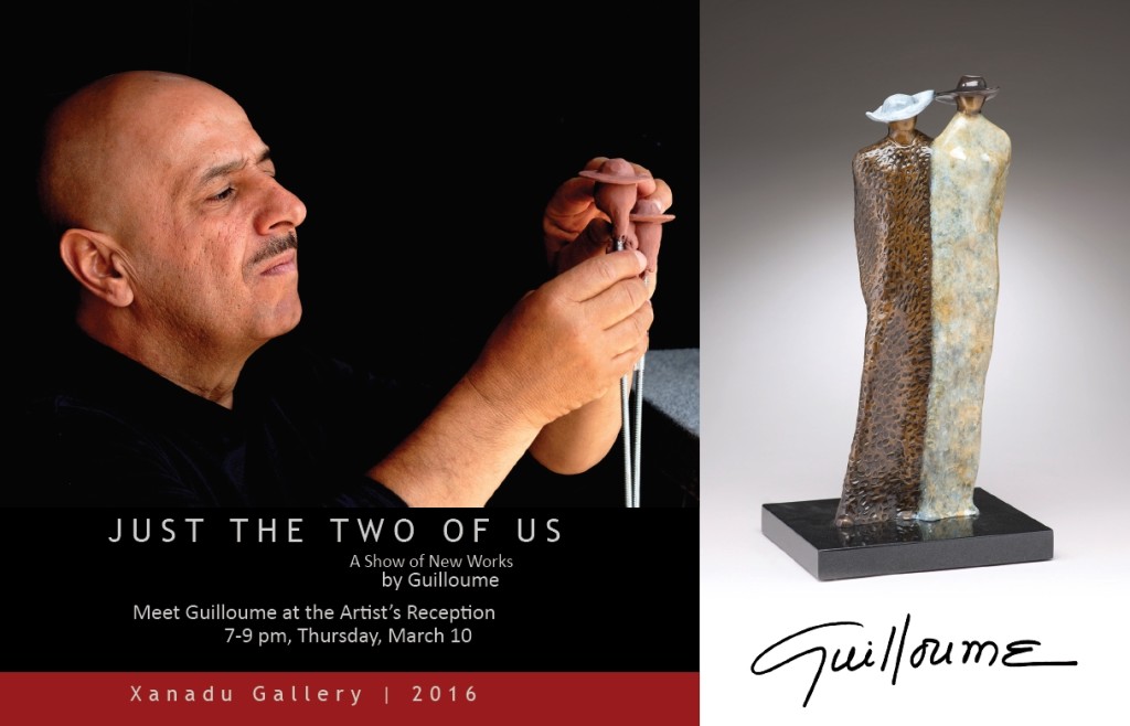
Guilloume show invitation 2016
Postcards have several key advantages. First, they don’t need an envelope like a booklet would. This saves on printing and postage costs, but I also like postcards because our clients can see all of the information as soon as they touch the card – they don’t have to open an envelope to see the artwork or see the show dates. It’s also easy for the client to grab the postcard and use it to get them into the gallery at the right time.
There are a wide range of printers online who will quickly and inexpensively print postcards. We typically use vistaprint.com. Whenever I mention vistaprint, I receive emails from artists telling me how much they hate VistaPrint for their customer service, or that their prices, or that their color reproduction isn’t the best.
I do get it, but please don’t send me an email about your experience with VistaPrint. I stumbled across them a long time ago and have had great luck using their services over the years. If you prefer another company you will find many of the same tools and options on their sites.
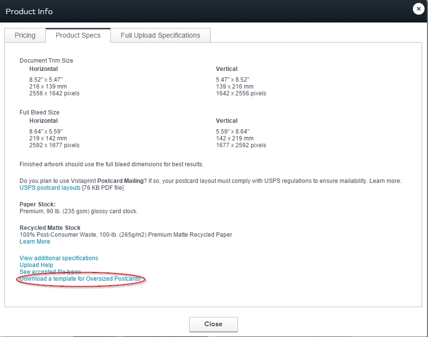
The first thing we’re going to want to do when we go to the vistaprint site is download the design template. We are going to do an oversized postcard at about 8.5” x 5.5.
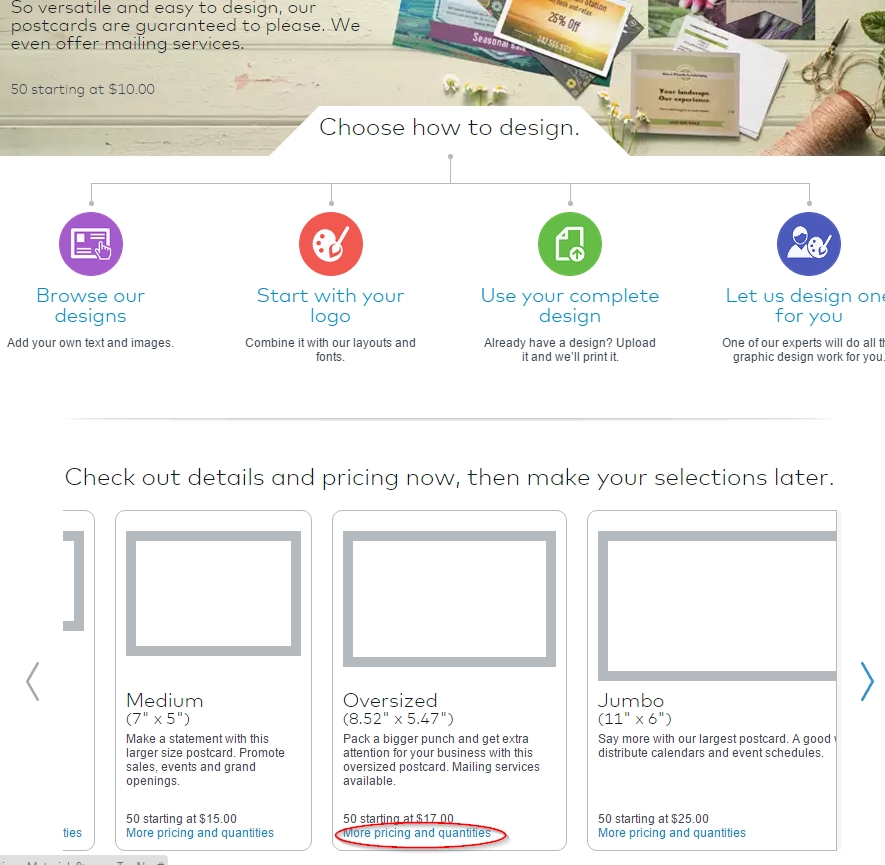
When we select that option, we’ll see the sizes we need to set our photoshop design at: we’re going to do the full-bleed design, which means that our images can extend beyond the edge of the design. Bleeds look professional – you’ll see how we use them in our design.
From the product specs page, we can then click on the Download a template for Oversized Postcards link. Now we can download the file that will be set up to print at just the right size.
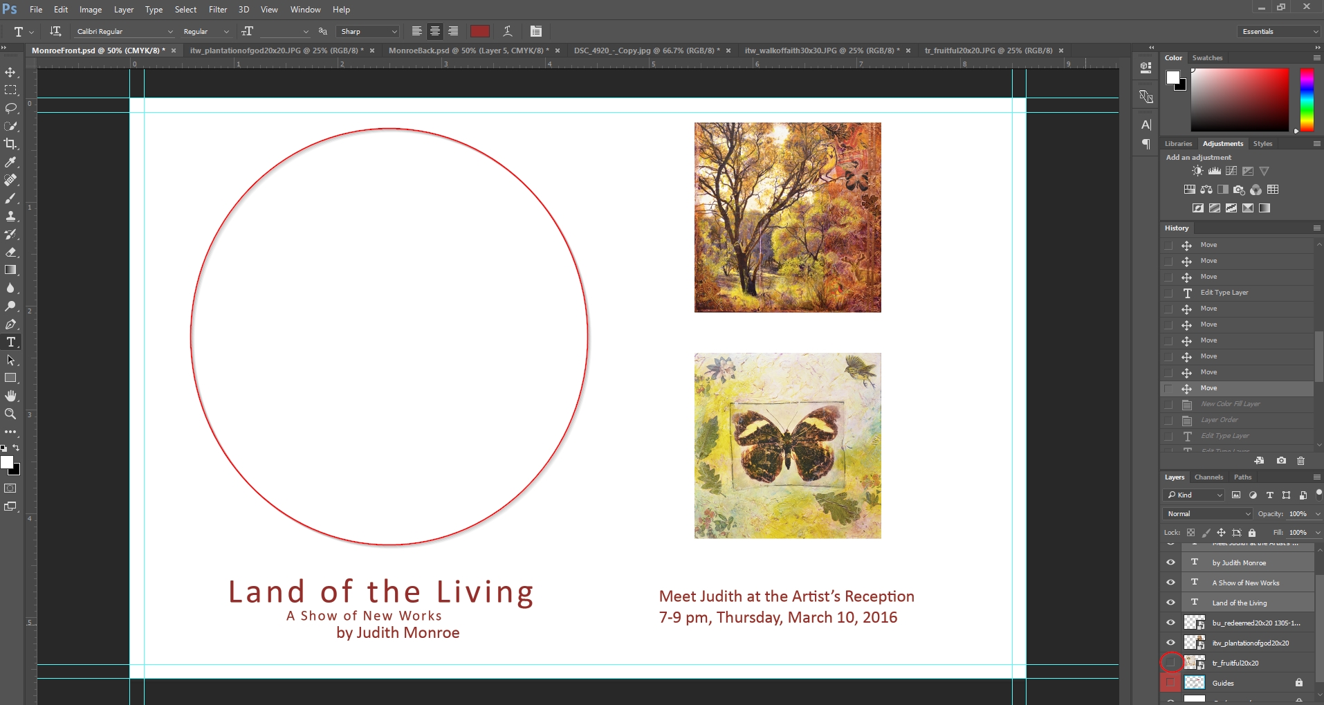
When we open the file we’ll notice that it creates guides that serve to keep us from losing any of our content when the card is printed. The red line shows us where the edge of the card is going to be. The blue line shows us a guide of the edge beyond which no text or images should extend. This is important because even though the red line tells us where the edge should be, there are going to be times when the card is cut imperfectly. The space between the trim edge and the safety line gives us a margin of error.
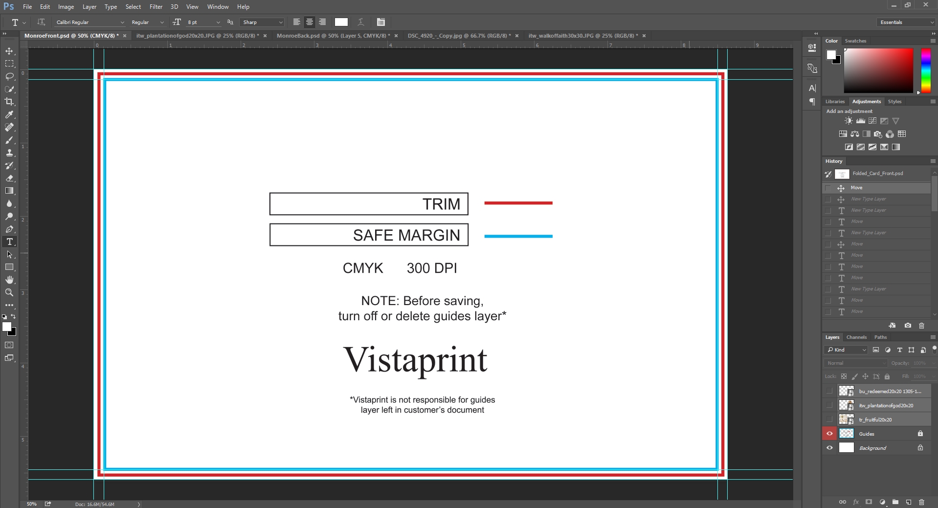
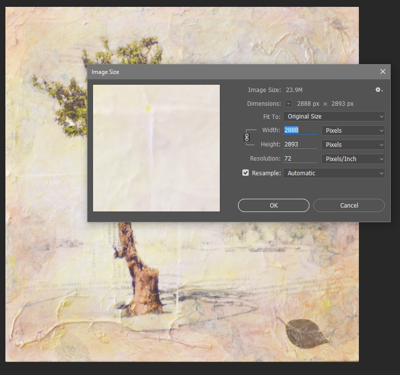
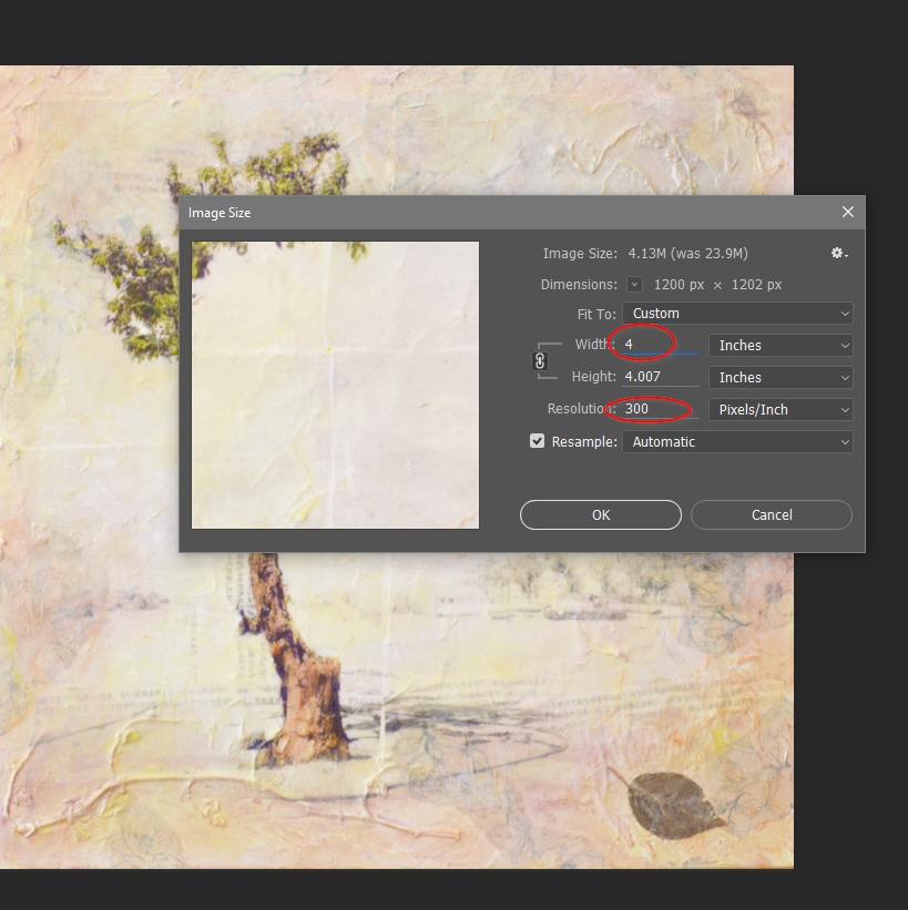
Notice that the guide image tells us that all of our images should be 300 dpi. This is resolution at which images will appear sharp and clear on a 4 color press. Any lower resolution and the image can appear grainy and distorted.
I’ll show you how to determine your image resolution in just a minute.
Now that we have our file setup, I’m going to go ahead and save it into our design folder.
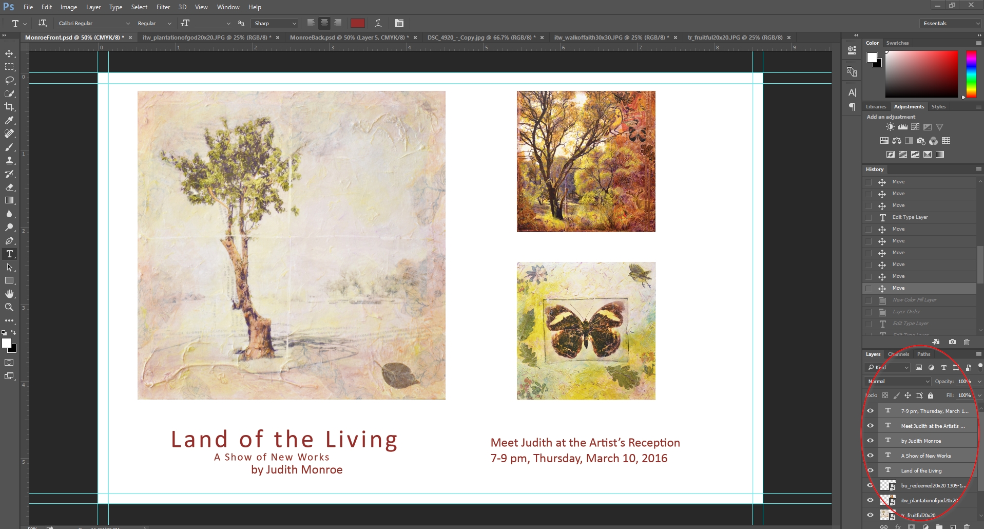
The rest of the design process is simply a matter of placing images, selecting background colors and inserting our text.
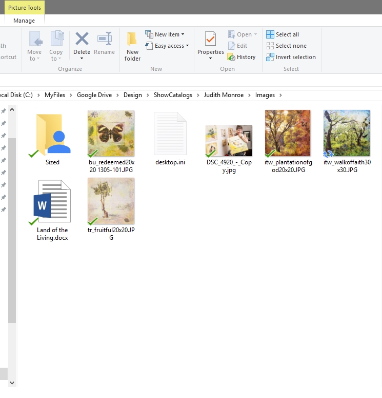
I’ve already gathered all of the images Judith provided in my images folder. From here I’ll open and size the images.
We’ll size the main image at 4 inches, by 4 inches. We’ll fill a lot of the left side of the card with this image. Notice that I first set the resolution to 300 pixels per inch, and then I set the size to 4 inches wide.
Before Sizing
After Sizing
This can be a little tricky – and size and resolution often throw beginners off.
Think of a digital image as a pointillist painting made up of tiny dots. The smaller the dots, and the closer together, the less you’ll see the dots and the clearer the image will be. It is very important to understand that when you are resizing an image you can increase the resolution only if you decrease the size of the image. In other words, if you shrink the image down, you can pack in more pixels per inch and not lose resolution. The reverse is not true. If you try to keep the size the same, or increase size, while at the same asking Photoshop to increase the pixel density, you are asking the impossible.
Again, comparing it to our pointillist painting, once the artist has painted in the dots, you can’t pack more dots into an inch of his painting than were there originally unless you squeeze the painting down.
After we’ve sized the main image, we’ll size our two side images to 1.80 inches each and drop them onto our design.
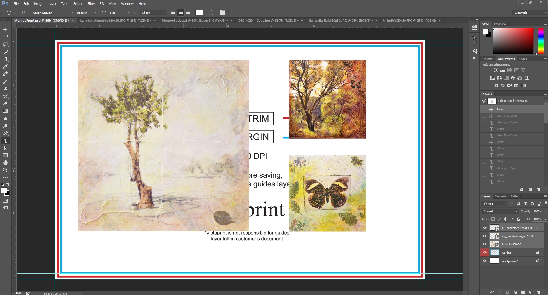
Now I’ll put in our text so that we have all of the major design elements in place. We’ll play with the scale to make sure everything fits together the way we want it to, and that everything looks balanced. Notice how I’ve given everything on the front room to breath.
Be careful with fonts. Often, early on in my design work, I would use very ornate or crazy fonts. This tends to look pretty unprofessional in most cases. If you don’t believe me, go to the website of any major technology or design company and look at the fonts they are using. You should also avoid using bold or heavy text. You want the font to be readable but not distracting.
The basics of the design are looking good, but now we want to add some dimension and try some different backgrounds.
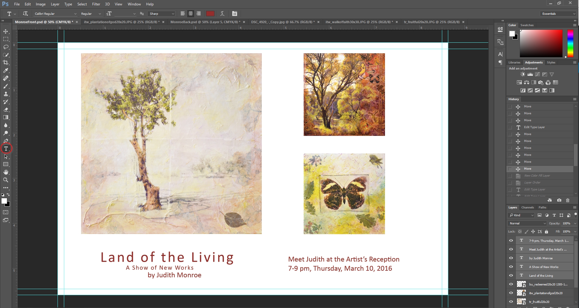
I feel like I would like to create some contrast to Judith’s lightly colored work. Black would be too harsh, so we’re going to try brown.
So how do we do this? For those of you not familiar with Photoshop’s layers, they are incredibly useful. You can think of your Photoshop design as several sheets of transparent film with each layer of this film containing design elements. The nice thing about layers is that it allows you to isolate elements of your design to make individual adjustments. If you look at the layers panel on the side, you should see that each element has its own layer.
Let me stop here to say that if your Photoshop doesn’t look like mine and your layers window isn’t in the same place, there are a couple of things you can do to get onto the same page.
First, navigate to your window menu at the top of the screen. Go to workspace and select essentials. This is the layout I prefer to work with. it puts the most important tools within easy reach.
If that doesn’t work, go back to the Window menu and click on the layers menu item.
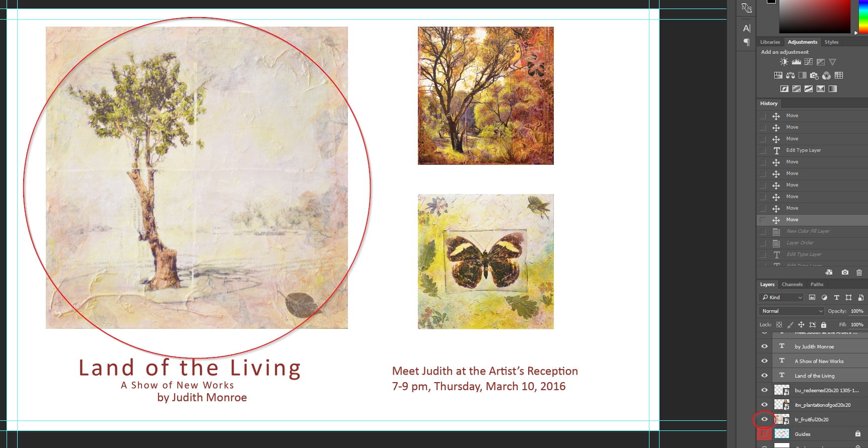
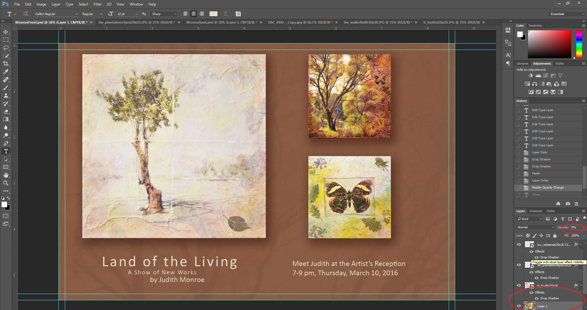
Now the layers will appear. Notice how I can turn off individual layers as needed so I only see what I need to see when I need it.
Layer Visible
Layer Visibility Turned Off
I’m going to create a new layer and make it brown. I’ll do this by going to the Layer menu, going to new fill layer, and clicking solid color.
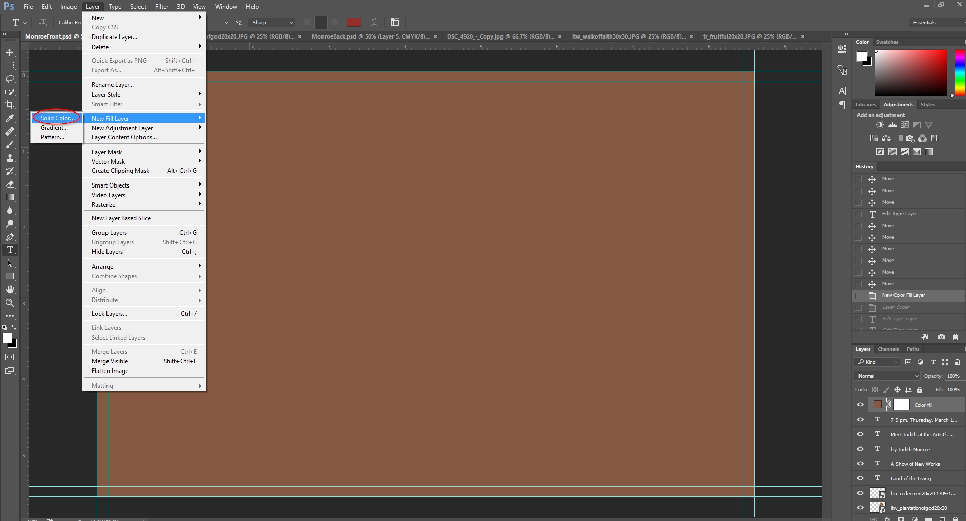
Notice now that I’ve covered everything up with the new color. All I have to do to put this color in the background is go over to my layers panel and grab that layer to move it to the bottom, like this.
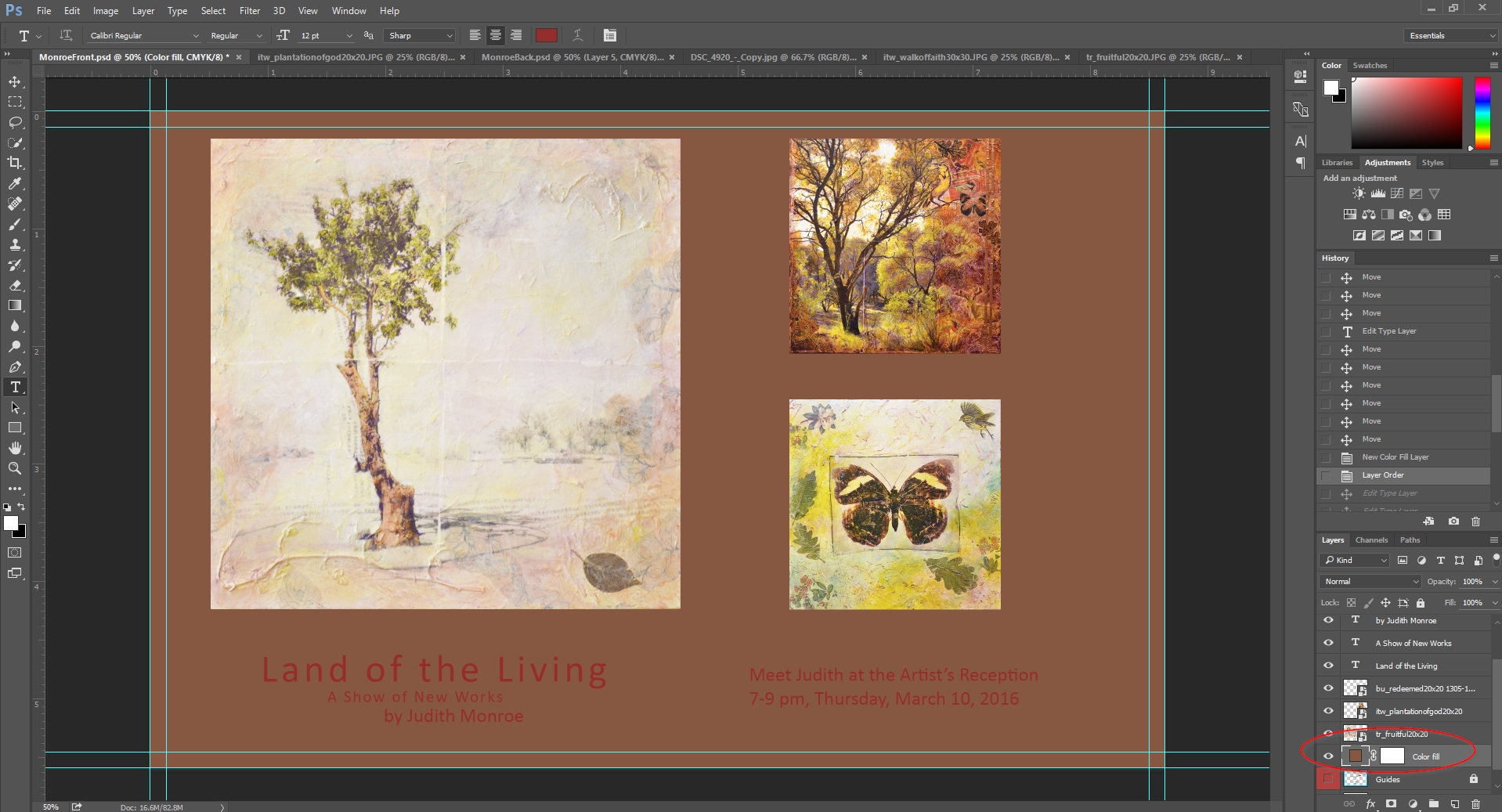
Now that I’ve done this, I want to add a few effects that I feel make the design feel more polished.
First, I’m going to make the text a lighter color for contrast and readability. For this, I like to pick a color from one of the featured artworks to create harmony in the design.
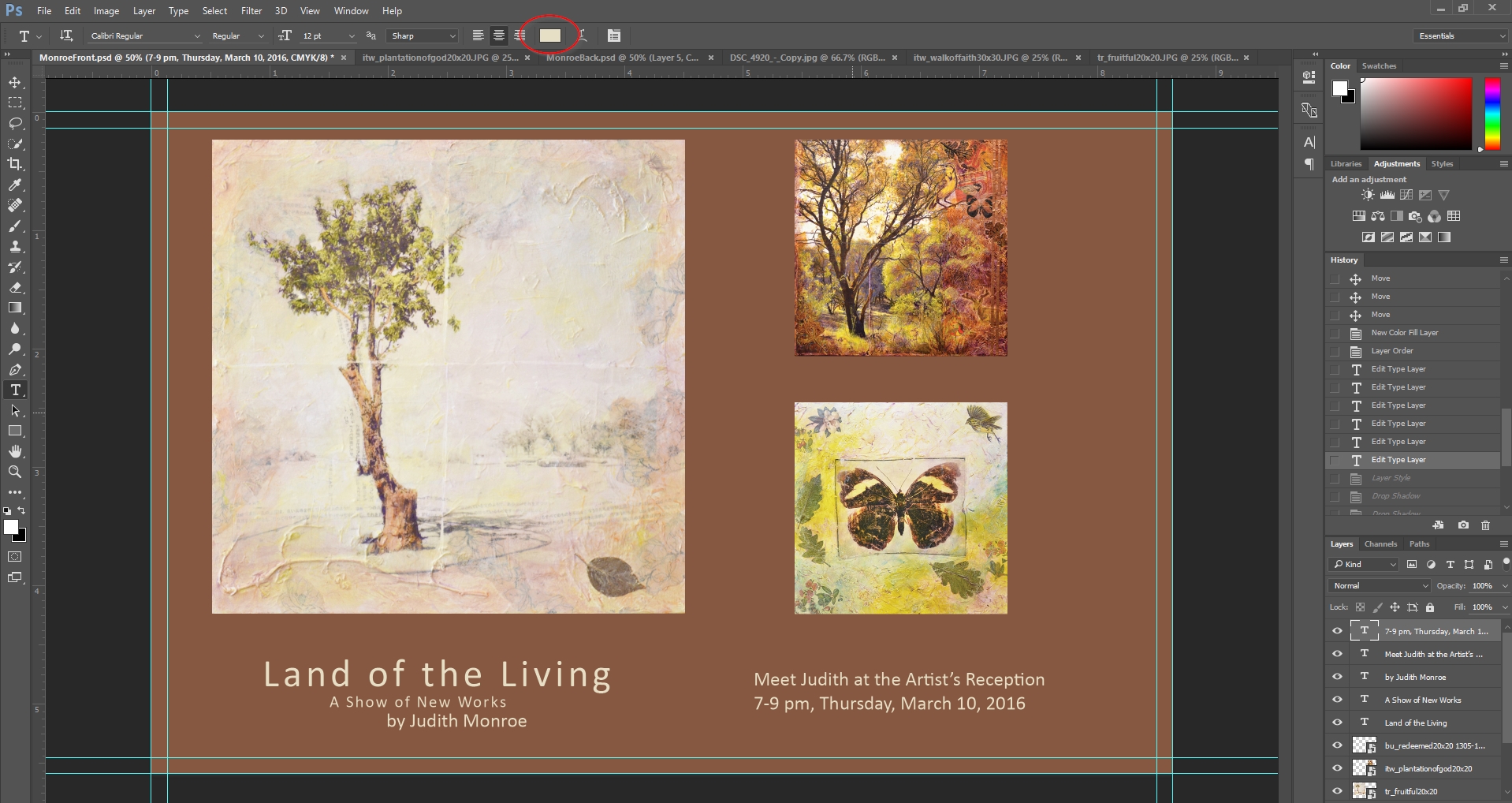
Now I’m going to add even a little more dimension by creating shadows for the artwork. This helps set the work off and adds a subtle 3d element. I create the shadow by selecting the layer, then going to the layer menu, layer style, & drop shadow. I can then select how large and pronounced I want the shadow to be, as well as the angle of the fictitious light that’s shining on the art. I’ll then do this for each layer that contains artwork. The nice thing about this shadow is that if you change the angle of the light on one layer, it changes the angle on all of the layers.
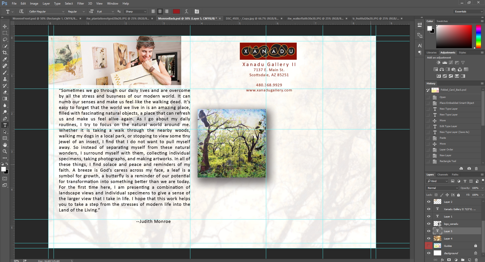
Now we’re looking pretty good, but I wish that there was even just a little more depth and texture to add some richness to the background color. A little trick we like to use to achieve this is to blow up one of the images we’ve used, copy it, place it on a new layer, right above the background, and then decrease the opacity of the layer until it’s barely visible.
This works particularly well with Judith’s work since her pieces contain a great deal of texture.
For a final design element, I’m going to add a red box behind the text to set it apart.
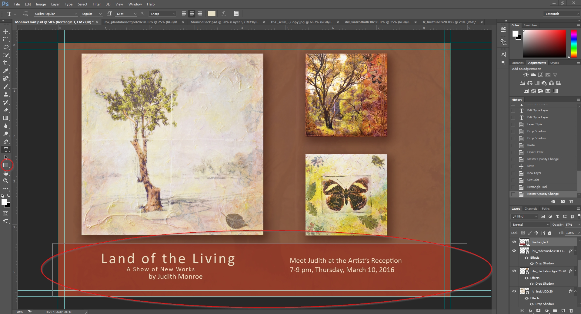
Now I’ve got the basics of the invitation front.
So now let’s jump around to the back side of the card. You’ll see that the back side is more complicated. We have to leave room for the postage and address, as well as space for the post office to add a barcode.
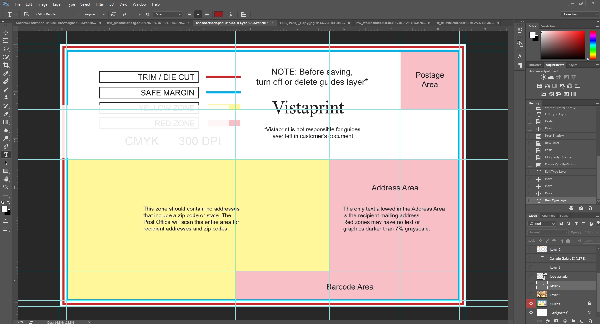
We’re first going to include the boring stuff, like my logo and address. I’m going to leave enough space for the stamp and address. Fortunately, the template tells me exactly which areas to avoid.
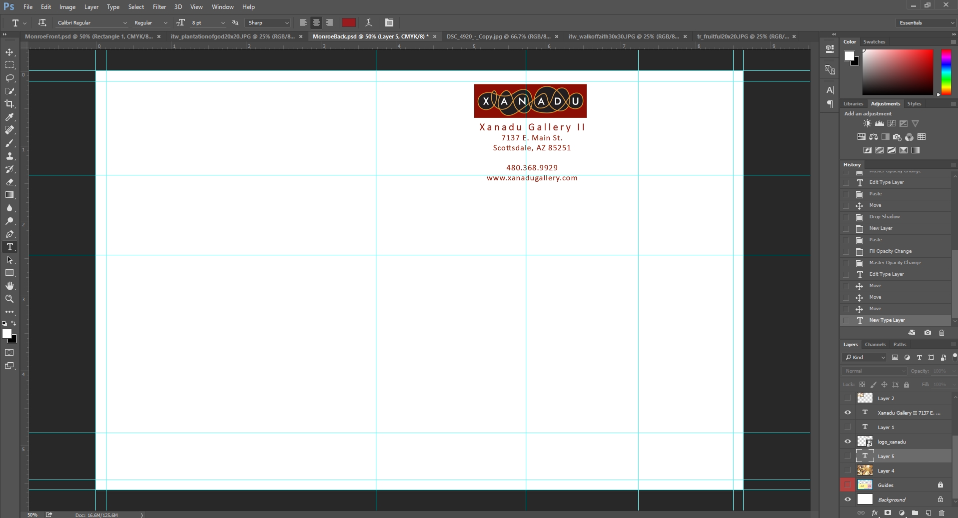
More importantly, I’m going to include Judith’s show statement. I want this text to be simple and easy to read. I’m also going to include a photo of Judith.
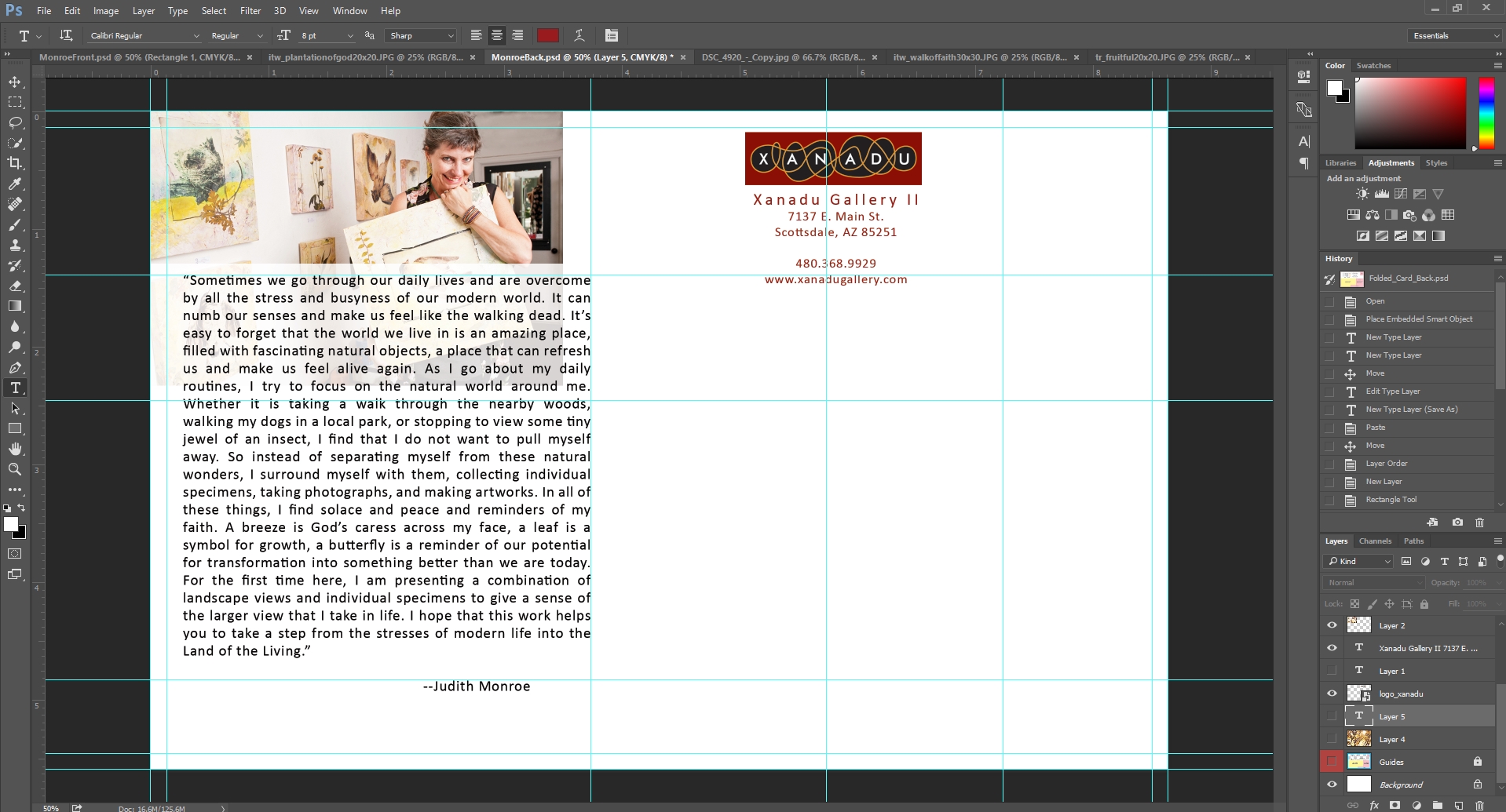
People love artist’s photos – it makes a huge difference to have them feel like they have a sense of who the artist is.
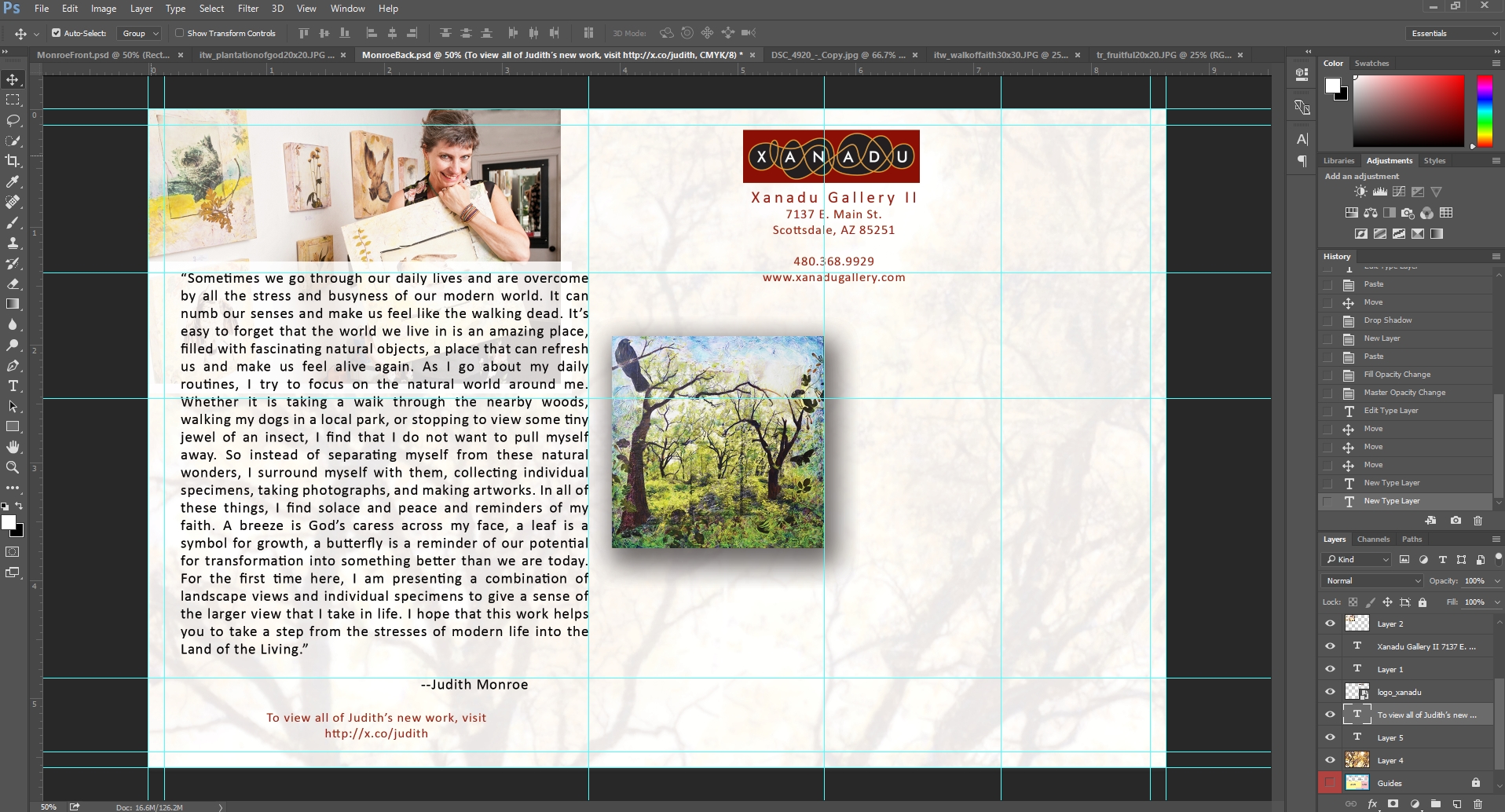
The back can be a bit of a challenge to design because we have a lot to include and a very limited amount of space in which to include it. I’ll play with the design until I feel like I have achieved a balance between the various elements and the empty space on the page.
Once I have the basic elements in place, I’ll add a shortened link that my collectors can use to access Judith’s page on our site. I use x.co, which is GoDaddy’s link shortener. I use it because a collector could be excused if they thought that x.co stood for XanaduGallery.com.
There are better link shorteners that allow you to track all kinds of click information, but the truth is that I use it simply to make sure my collectors can easily get to the artist’s page. Notice how I used judith’s name as the last part off the link.
And now that I have the basic design done, I’m going to print a copy on my laser printer to see how it looks in the flesh, so to speak. I don’t have a color printer, but I actually find that the black and white printer removes some distractions so that I can get a sense of the visual harmony of the card.
Once I’ve printed and reviewed the card, I’ll save the file as a pdf and send it over to my designer and to Judith for review, which means there may still be changes between the version you see here and the final print version.
Once Judith and my designer have approved, we’ll go ahead and order our invitation. I’ll order 1000 of the cards.
VistaPrint always has a sale going, so go to their special offers page to get a coupon code before you pay for your order.
I select the delivery time and place my order.
And that’s it. While designing and producing brochures and catalogs is much more involved, in the end, the exact same principles apply.
When we meet in our next session, I should have a copy of the invitation in hand to show you.
I hope you’ve found this brief tutorial helpful and interesting! In the next session, we’ll talk about how we send out the invitations and about everything else we’ve done to prepare for Judith’s upcoming show.
Thank you for reading the tutorial – I’ll look forward to seeing you in our next session!
Download and View the Postcard Front
Download and View the Postcard Back